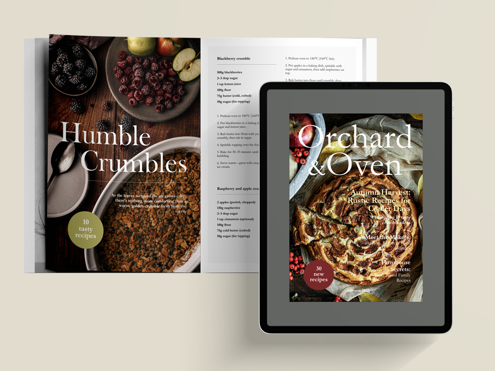
Orchard & Oven Magazine Design
Orchard & Oven is a rustic country food magazine that celebrates slow living, seasonal produce, and the stories rooted in the land. This was an editorial and brand identity project to develop a cohesive visual language across both print and digital magazine formats.
Role: Branding, illustration, and layout design for print and digital.
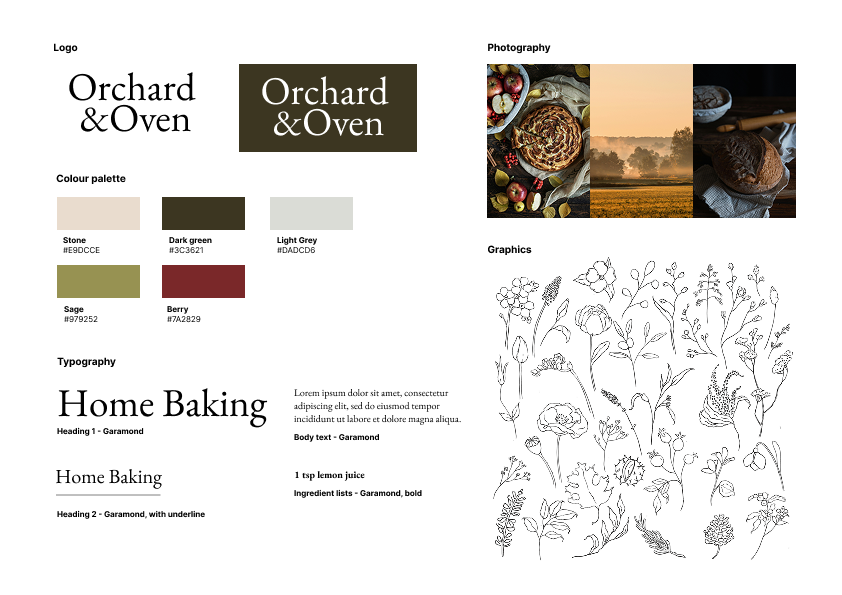
Branding
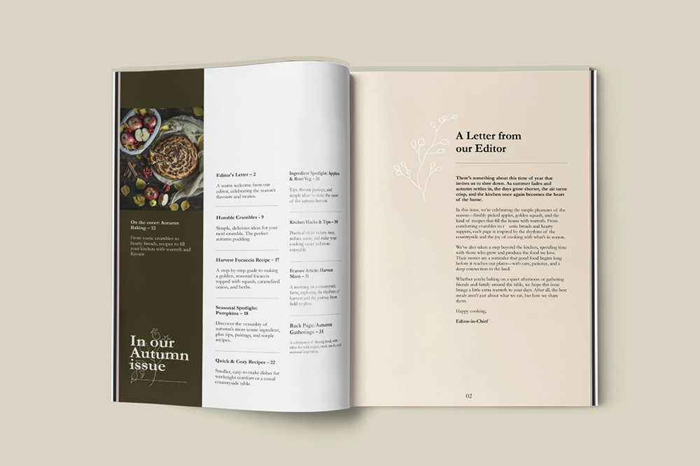
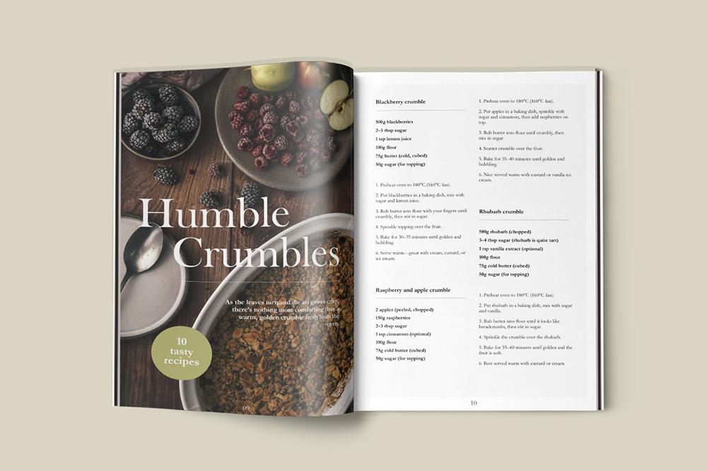
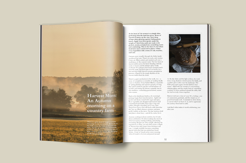
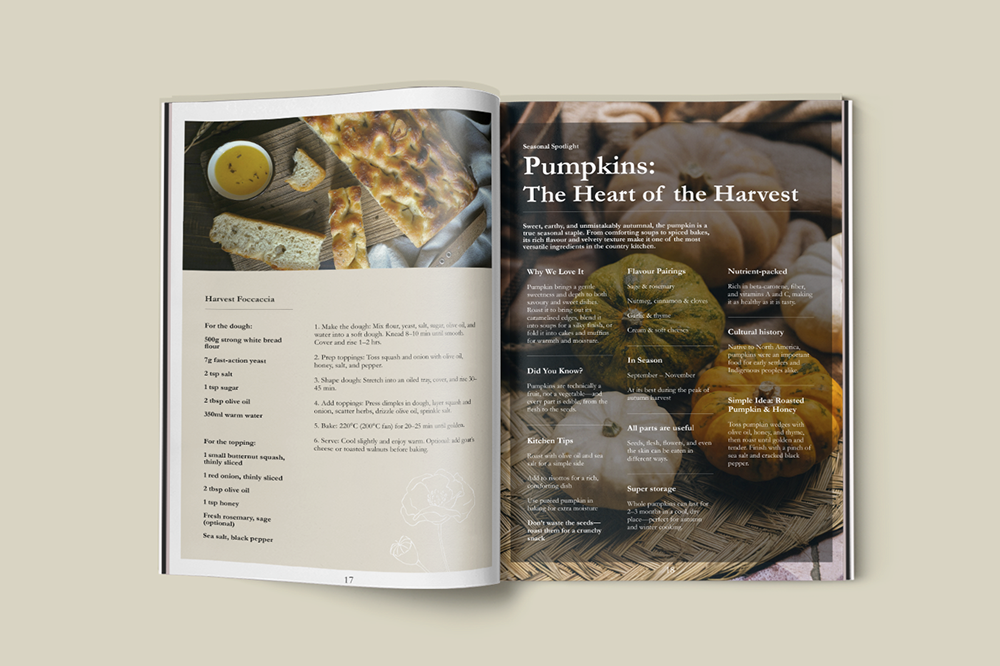
An inviting, cosy tone was established throughout the project. A soft, natural colour palette inspired by the countryside was paired with a serif typeface to create a traditional, elegant feel. This was complemented by photography that evokes a quiet, rustic atmosphere, resulting in a cohesive and authentic visual language.
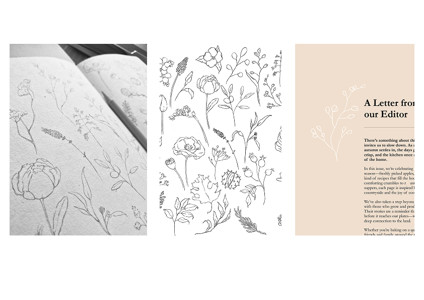
Illustration
To reinforce the organic aesthetic, I introduced hand-drawn illustrations as a subtle decorative element. These began as hand-sketched wildflowers and foliage, which were then refined digitally in Procreate. The illustrations are used throughout the magazine in varied colours, adding gentle visual interest while maintaining a minimal, cohesive feel.